
Thursday, December 6, 2007
Friday, November 23, 2007
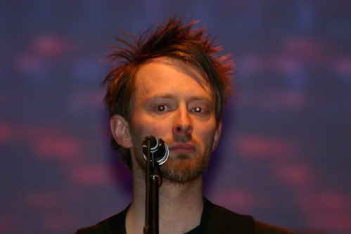
2007-October 08 | The Scotsman
'It's the most over the top thing that I've ever done'
DAVID SMYTH
ALL the talk in the music business in recent days has been of Radiohead's "honesty box" policy for Wednesday's release of their In Rainbows album, and the question of how much you should choose to pay to download new music by one of the world's most important bands.
But perhaps that's missing the point. The group's spokesman reports that, so far, not only are fans choosing to fork out a reasonable sum for the download, but the majority are choosing instead to order the "Discbox" - a £40 version not released until 3 December, which features the album as a download, CD and two 12-inch vinyl records, with eight extra tracks and a lovingly compiled lyrics book full of new artwork by Stanley Donwood.
If the download could be a steal, this is a serious financial commitment. So is it worth it?
"It depends how rich you are!" I'm told by Donwood, who has designed every Radiohead release since their 1994 single My Iron Lung. "If you're on the dole, of course it's a hell of a lot of money. But it costs about that much to go to a Premier League football match, and this project has taken an incredible amount of work. It's been a long journey over ten months, with the artwork evolving as the music has evolved. And it weighs about half a kilo."
The artist has become a "sixth member" of the band, hearing new songs as they are created and adapting his visuals accordingly.
For In Rainbows he's been trying a photographic etching technique, putting prints into acid baths with random results. He keeps the finer details close to his chest, and the band refuse to show off the box properly until the release date, but a small picture at www.inrainbows.com has multicoloured blocky text contrasting with scratchy grey abstractions. "The finished product is quite a lush thing. It's the most over-the-top project I've done with [Radiohead]."
It's an odd position for a major band to be in, where their music could be perceived to be of little monetary value while the artwork costs a bundle. But for Radiohead, Donwood's apocalyptic visuals have long formed a vital part of a complete package. They perfectly complement the songs, from the weeping cartoon minotaur of their Amnesiac album to the grim painted street plans of Hail to the Thief, plastered with words such as "snakes", "poor souls" and "venture capitalism". An impressive new book of his Radiohead-related work, Dead Children Playing shows his progression from the pharmaceutical logos of their greatest album, OK Computer, to the linocut cityscapes of The Eraser, last year's solo album by frontman Thom Yorke.
He studied fine art with Yorke at Exeter, and says they share a similar bleak worldview: "We shout at the same bits of the news."
His close involvement is paying off. Unlike bands such as Hard-Fi, who have claimed that artwork is irrelevant in this iPod age, Radiohead and Donwood's success with their latest innovation shows that, if it looks great as well as sounding great, music can still be very valuable indeed.
• Dead Children Playing is published by Verso on 22 October. In Rainbows can be downloaded from www.radiohead.com from 10 October.
http://living.scotsman.com/index.cfm?id=1603372007
Wednesday, August 1, 2007


Tuesday, July 31, 2007


Friday, April 27, 2007
THE CULTIVATION OF CULTURE
Hello Mr. Donwood! Its an honor and a privilege to be speaking with you. Thank you so much for taking the time out to do this interview. I am not worthy.theroyalmagazine
Q: Would you be able to tell us a bit about your background? Fine art and graphic? How did the relationship between you and Radiohead develop?
I was born in Essex, a typical English county north of London, and I became a typical representative of that bleak region. Essex is essentially a flat land that slopes almost imperceptibly into the grey waters of the North Sea, and the people of the county can frequently be seen standing on our crumbling sea defences, staring silently out at the mudflats. It is not a place that the Tourist Board mention often in their paens to the variegated beauty of Britain.
When I was quite little I vaguely remember drawing pictures of flat horizons, drawn again and again on layer after layer of tissue paper, and then glued together. These ended up looking like a sort of foggy nothingness. And I drew huge housing estates on lengths of discarded computer printout paper. Later, I managed to bluff my way through art college mainly by staying out of the way of the tutors. I didn't much care for art, but it was definitely preferable to most of the other options available to a teenager from Essex. I think any graphic sensibility I might have dates from an afternoon when I ate a quantity of liberty cap mushrooms and had a sort of vision.
I first met Radiohead when they weren't called Radiohead and they were sharing a small house in Oxford. I was hitch-hiking around England with a mate called Jim, and we were busking a fire-breathing show. We had a plan to support the band at a pub they were playing in, the Jericho Tavern, but the landlord prevented us. He was worried about the fire risk, which was a pretty reasonable concern. Firebreathing is a terrible way to make a living really; you risk getting pleurisy, setting fire to your clothes, and your breath smells like an oil refinery. I'm glad I gave that up. Anyway, some time later (years? I don't remember) Thom phoned up and asked if I wanted to try making a record cover for a single, which was called My Iron Lung. It took months to do it, because I didn't really know what I was doing, at least as far as the technology went. Since then I've got quite a lot better. At least, I like to think so.
Over the years that have passed I've worked rather closely with the band; and I've seen the recording process and how it works in different locations. Place seems to have a profound effect on how songs are filtered. Recently we've been working in a derelict stately home in Wiltshire; I'll be listening closely to see if that place has any perceptible effect on the recording.
I listen to a record a lot whilst it's being made and I'm making the artwork that will accompany it. It's hard to make art in silence. Well, it is for me, anyway, and the music has a pronounced influence on how the images end up, the sort of energy used to create them, composition and so on. My hope when making artwork for a record is to create something that weirdly enhances the music, something that affects the way you hear it. I stress the word 'hope' in this case.
Q: Influences? Social? Political? What are your biggest influences? What inspires your art?
This is such a hard question that I've made a cup of tea to help concentrate my thoughts, and to possibly help me recover memories buried under the sludge of my lifestyle. I was greatly influenced by the Left wing in Britain in the 1980s. Leftwingers are pretty much like liberals in the US; you know, pro-choice, antiracist, antisexist, environmentally concerned, dismissive of money, openminded... A lot of the socialist-leaning spectrum of politics appealed greatly, and most of it still does. Although it has all got extremely complicated of late. I became aware of politics at about the same time that a vindictive harridan named Mrs Thatcher began her rule over these islands, and resistance to her and her ilk (and political successors) became a vital task.
I became aware of Peter Kennard's work for CND, the Campaign for Nuclear Disarmament, before I knew anything at all about art or artists. He took the photomantage techniques pioneered by John Heartfield in the 1930s and 40s and updated them for the 1980s. He 'appropriated' John Constable's famous painting of The Haywain, which is this bucolic 18th century oil painting of a hay cart crossing a river, and stuck cruise misiles in it. Fucking brilliant. It'll be on the web somewhere.
A bit later on I discovered the work of Gee Vaucher, who did all the artwork and graphics for an Anarchist band called Crass. She used mostly just black and white, and the results are spectacular. More recently she's done a grand print of the Statue of Liberty, but with Liberty's face in her hands.
But like most people, I try not to be too 'influenced' by anything in particular or any one person or idea. I suppose that I go through phases of enthusiasm or engagement, each of which passes fairly quickly. In the last few years I've been influenced and inspired by Giovanni Piranesi, Japanese packaging, Hieronymous Bosch, A - Z street maps, Samuel Palmer, chromatography, Edward Munch, directional signage, Iain Sinclair, grafitti tags, Paula Rego, pylons, Peter Ackroyd, Scandinavian printmaking, Edward Hopper, Los Angeles advertising, and so on and on and on.
Q: I love the mixture of digital and analog methods to some of your work. For example, the Kid A album cover - Can you give us a short synopsis and process of that work?
That was painted, originally, on big canvases, 170cm square. It was the first Radiohead artwork project that was done off-computer. The whole of OK Computer and all the singles that went with it were all done with an aging beige PowerPC and a stupid fucking mouse. I pretty much hate computers. Anyway, all these paintings were made, and obviously a CD is really small, so I had to find someone who could take high quality photos of the paintings so I could scan them and squeeze them into a computer. There's a whole load of writing about the circumstances behind the paintings on my website, if anyone's interested. There was a 3D program around at the time that allowed you to take a high-contrast version of a section of a painting, transform it into a bumpmap and then drape the full colour version of the painting onto it, and then 'fly' a camera through the canyons that the painting was turned into. Unfortunately I couldn't figure out a way of getting the results off the computer except for taking a screengrab, which explains why so much of the imagery is pixellated. I like that, on occasion. The packaging for Kid A turned out to be a bit of a nightmare. Before I started on the project I took a CD jewel case apart and I realised that there was a gap between the CD tray and the back panel, so I thought that I'd design a second booklet to go in that 'secret' space. The booklet for the usual space, ie., inside the front panel was composed of multiple foldouts, bits of tracing paper and hidden images of devils. It was very hard to design, and apparently a complete bastard to manufacture.
Q: Dr. Tchock? Tell us a bit about this fellow...ha. If I'm correct, that is Thom Yorke's alias. Tell us a bit about collaborating with him in a fine art setting. He is a musical genius. How does that correlate into your collaborations?
Thom Yorke's alias? Yes, I've heard that too. Stanley Donwood is one of his other names, according to some people, so perhaps you're interviewing him. The best way that I can put it is that Dr Tchock isn't Dr Tchock and Stanley Donwood isn't Stanley Donwood. The reasons why we have adopted these pseudonyms has nothing to do with being on the wrong side of the law, being on the run, or attempting to avoid paying tax.
Working with the Doktor is okay. What happens is, I do some artwork and then he fucks it up. But then I fuck up what he's done. Then he fucks up what I've just done even worse. So I try to completely fuck up what he's done. In the end we sort of agree to disagree. Over the last year or so I've realised that I am a perfectionist whose natural inclination is to make things neat. I detest this tendency within myself. I have also noticed that Dr Tchock has tendency to smash things up, throw them around the room and then regret his rashness. I think that together we ameliorate the worst in each other.
Q: If you are at liberty to say, are you going to be working on the cover for Radiohead's new album? If so, any hints you can give us as to the direction of the piece? Digital mixture like KID A or straight fine art like HAIL TO THE THIEF?
I have no idea what the cover will look like yet, but I'm using wax, hypodermic syringes, ink, copper plate, needles of various sorts, bitumen, nitric acid, and paint.
Q: Whats in store for the future?
Oh boy. Assuming that we don't find ourselves in some variety of terminally dreadful war, with aggrieved nations all over the planet loosing off nuclear warheads at each other, I imagine that a combination of rapidly accelerating climatic change coupled with the unavoidably awful consequences of the end of our hallucinated hydrocarbon-based economy will trigger off massive human migrations, water shortages, crop failures, infrastructure collapse and death on a truly apocalyptic scale. It's not an uplifting message for your readers, I agree. Happy new year.
Thanks so much for your time Stanley! Appreciate it so much. Keep inspiring us!
I'll try.
INTERVIEW BY: NIGEL DENNIS / ELECTRICHEAT.ORG


Interview with Stanley Donwood
//Ekin Sanaç//--bantergi
An exciting time of the year for the Radioheads... It’s not just for the ears, it’s also for the eyes. Thom Yorke released his first album that he recorded without the rest of the gang and it’s called “The Eraser”. Stanley Donwood answers Bant on the story behind the artwork of the album.
* Although I wouldn’t have guessed for it goes perfectly well with the content, according to what I read on the website, this work was not initially made for the cover art of “The Eraser”. How did they end up together? How do you connect “London Views” to “The Eraser”?
I didn’t connect the two; that was Thom. I just sort of encouraged the connection.
* Has there been a researching process for the “London Views” work, for it is a panoramic view of the city?
A kind of accidental research I suppose; more an agglomeration of disparate pieces of information that coagulated to form the eventual artwork. I realised the other night that I’ve actually been going on about this artwork for literally years; boring my friends at the pub and definitely boring my girlfriend. Originally I was going to make medieval-style pictures of modern cities being destroyed, using vellum, tempera paint, gold leaf and so on. But somehow I forgot about that and concentrated on the single colour woodcut style.
For the actual process of carving the picture, I used a London A-Z map and Google images. I was actually in London, but I didn’t want to pollute the purity of a more imagined scene by going and doing that en plein-air stuff.
* I suppose the floodings that took place in Cornwall in 2004 are one of the stories that ended up in the album cover art. Have you actually experienced any natural disasters yourself? What are some other stimulations and trulife stories that have been effective on “London Views”?
No, I’ve been lucky. The floods in Cornwall are the closest I’ve ever been to a real disaster.
* Are we free to assume that “cnut” is a delibarate misspelling of the word “cunt”?
No way. Cnut is an alternate spelling of Canute (also Kanute) who was a Saxon king of England from 1017 until 1035. There is a legend about him which states that his advisors were so convinced that he was a divine being that he could control the tides. To show his humanity and humility, Cnut went down to the beach, ordered his throne to be taken there, sat in it, and commanded thje tide to cease its advance. It didn’t.
I suppose I’m vaguely making a point about global warming/sea level rise.
* Are there any secret, hidden things in the booklet of “The Eraser” ?
No, there aren’t, unless they exist in the differing opinions of the people who see it. This is, I realise, quite unusual for me, as I often find myself layering hidden meanings into artwork. I intended this project to be more ‘tabloid-like’ – really bold, very graphic, almost like a shout rather than a whisper.
* You mention that only 8 copies of the original piece has been made as the technique is fascinatingly hard. Are they all sold out by now?
No, they aren’t. I think that they’re quite expensive. But if you’re feeling wealthy...
* About global warming threat, Noam Chomsky said that there is still hope to win over it, but unfortunately there is no time... How are we supposed to go on as if there is nothing, knowing that the Apocalypse is soon?
I have absolutely no idea. It does seem quite hopeless, but perhaps that’s just my own 37 year old pessimism. Human existence does seem to be a largely savage endevour, briefly punctuated with short periods of happiness. I think that I’m quite depressed though, so you shouldn’t listen to me.
* To you, what are the most inconvenient things about London today? Which place in London is the most peaceful place to you?
The most inconvenient thing is the internal combustion engine. The most peaceful place is by the pond in Temple, just off Fleet Street.
* Have you sensed anything interesting among the band members, some chemistry that is different from the previous albums? Or any “worth telling” stories?
There isn’t a Radiohead Official Secrets Act, but there might as well be. If something was ‘worth telling’, then I couldn’t possibly tell you it.
* Any tips about the cover of the upcoming album from Radiohead?
Ha ha. I think it would be unwise for me to be too definite because I don’t know how it’s going to turn out. The first occurences will probably be on the front few pages of www.radiohead.com, and keep an eye on how we are living in the last days of our hallucinated economy...
* Do you have favorite websites? What is the opening page of your personal computer?
I am so unbelievably dull that the opening page on my computer is my email page. My favourite websites are, maybe; www.schnews.co.uk, and http://www.zmag.org/weluser.htm, and http://www.project-ctrl-alt-del.com/
These aren’t really ‘favourite’ websites, just some that I return to. I do a bit of research using the internet, and I’m quite curious about how something so new has so radically redifined our ideas about communication, academic study, activism, and, er, shopping.
* What are some of the tunes that are playing constantly on your music player nowadays?
I haven’t got a music player. I have accidentally totalled my record player during a fit of techno-rage. The last thing I played on it was ‘Hit Me With Your Rhythm Stick’ by Ian Dury.
*What has been your favorite song on “The Eraser”?
Skip Divided. I think it sounds dirty.
Donwood Dresses Up Thom Yorke Solo Album
June 15, 2006, 2:20 PM ET--billboard
Katie Hasty, N.Y.
Artist Stanley Donwood was fascinated by the floods in Cornwall, England, two years ago, inspiring part of his recent exhibition, "London Views." His woodcuts and general interest in the catastrophes of London also seemed to jive with Thom Yorke's upcoming solo release, "The Eraser." And it's his piece "Cnut" that will ultimately grace the cover of the album, due July 11 via XL.
"As often happens, the concurrent work that we were doing -- Thom with the music, and me with the artwork -- seemed to intertwine," Donwood tells Billboard.com. "We realized that the 'London' stuff would fit perfectly with 'The Eraser,' which in a lot of ways seems a very English record. There was something about this immense torrent washing everything away and the futile figure holding back the wave (or failing to) that worked with the record, especially as we had both seen the flood, just when Thom was starting on the music that would eventually become 'The Eraser.'"
"The Eraser" is packaged as one large foldout card of art, in which the CD will be slipped. "The packaging was a bit of a f***er, because the picture at actual size is about 12 feet long," Donwood admits. "We both wanted to avoid using plastic, apart from the CD itself of course."
Donwood (whose real name is Dan Rickwood -- "I like to separate the person I am at home -- washing up, vacuuming, picking up the kids from school and so on -- from whoever Stanley Donwood is," he says) has been friends with Yorke since their days at the University of Exeter. The pair won the best album packaging Grammy for Radiohead's 2001 album, "Amnesiac."
"[The Grammys] didn't really work out well," Donwood says. "A lot of the things that happened on that visit to Los Angeles were utterly alien to me and quite frightening. I smoked too much evil Californian weed and got the heebie jeebies. I was too paranoid to go to the after party and I had an unpleasant run-in with some over-zealous post-Sept. 11 security guards."
Artwork from his various projects is available through Donwood's Web site, which also features some of his writings. But despite his Radiohead association, Donwood says he's never dabbled in music of his own.
"I can't read music, can't tell a guitar from a bass and haven't ever tried to play anything. It's a sort of blind spot in my life," he laments. "I mean, I suppose being a musician is vaguely equivalent to being an artist or a writer -- but much better. Music is more immediate than [visual] art or writing because it has a visceral reach and can alter your mood much more comprehensively and immediately."
As one would expect, Donwood has been given a sneak peak into some new Radiohead material, much like audience earlier this week at the band's New York shows.
"All [the songs] are good! There are a couple of songs -- 'Down Is the New Up' and 'Videotape' -- that are so beautiful. I just pray they don't f*ck them up in the studio. But as I said, I know nothing about music, so really I should keep my gob shut," he jokes. "I think the new work demonstrates a kind of freedom or release. The long-awaited happy album from Radiohead it is not, but I think there's an amount of dark humor in it. Or not."
Stanley Donwood interview with GQ
July 25, 2005
Stanley Donwood is the semi-official sixth member of Radiohead. Having designed all artwork from The Bends onwards, he has created one of music's most distinctive band images. Now he's screen-printing old favourites and new classics, and selling them through his website. Here he tells GQ exclusively why.
How did you first get involved with the band?
"I have lied about this so many time that the truth, if there ever was one, has become impossibly sedimented in the strata of my deceit." (Donwood met lead singer Thom Yorke at the University of Exeter)
Who or what inspires you?
"The first pictures that I ever saw were by John Constable, on biscuit tins and as jigsaw box lids. When in the Eighties I saw Peter Kennard's versions of these paintings, with 'The Haywain' as an image of a missile launcher, I knew that I could be an artist. Or something."
What's your favourite Radiohead artwork?
"Kid A. The artwork for this record was almost impossible to do. I wanted to make artwork that looked, from a distance, like jewellery thrown onto mud, but close up revealed itself as the most ghastly shit that people can ever do to each other. I was fascinated by the horror in the Balkans at the time. At the same time, this was a continuation of the work on OK Computer, and it continues on Amnesiac and Hail To The Thief. So they're all inextricably linked."
Are you, for sound bite purposes, "the Terry Gilliam of Radiohead"?
"While it's really complimentary to be compared to someone such as Terry Gilliam, I don't honestly think it's appropriate. God, I'd love to make something as good as Brazil. Here's the riposte: a sound bite is a statement designed to preclude the possibility of intelligent thought."
Do the band have input with your work?
"Oh, man, I'm terrible at working on my own. There's no frame of reference, no one to tell you if what you're doing is good or fucking terrible. I once spent two months working on this idea that combined topiary with porn. I joined the National Trust and everything, just so I could cycle to all these gardens that had famous topiary in them and photograph it. I wanted to make pictures that had phallic topiary fucking vulva-shaped clouds. Quite tastefully, I might add. Anyway, there I was, taking photos and really getting into it... until Thom told me that it might not be.... quite the thing... for the new record. Honestly, topiary and photography... what was I thinking?"
So why the new venture?
"I hadn't screen-printed for about 15 years and I thought I'd better start with something I knew. And I imagined that a few people might like proper versions of pictures only ever seen as the 12x12cm images in jewel cases."
Stanley Donwood: Radiohead's Artist Interview
You can't judge a book by its cover but a good cover will leave a lasting impression, especially when you are talking about album covers. Abby Road anyone? Through the years an artform has emerged tied in with rock and a few artists' work have become synonymous with the bands they create the artwork for. Mention the name Derek Riggs and Iron Maiden fans will immediately know who you are talking about, the same goes for Stanley Donwood, the man that has given Radiohead a visual signature as distinct as their music. antiMUSIC was fortunate enough to conduct an email interview with Stanley recently to discuss his work for Radiohead, his writings and his new storefront where fans can buy high quality screens of some of his favorite works. We asked Stanley to give us the inside story on each piece of art and we got back an interview that demonstrates the quick wit behind the man that has created the unforgettable Radiohead art. (Several additions have been added to the storefront since we originally sent the interview to Stanley so not all of the pieces are covered here)--antimusic
antiMUSIC: What first inspired you to become an artist?
Stanley: 'Artist' was just the most convenient way to describe myself on application forms for unemployment benefit. I'm not really sure if it describes what I spend my time doing. Obviously, on the forms I couldn't write 'loafer', 'lazy sod' or 'dole scum' or they would have refused my application. Looking back on the earlier years of my existence, I suppose it was wax crayons that inspired my decision to draw pictures.
antiMUSIC: How did you hook up with Radiohead?
Stanley: I think that my obsession with nuclear apocalypse, Ebola pandemics, global cataclysm and Radiohead's particular brand of unsettling melody have gone together quite well. How this came about I can no longer accurately recall, as I have children and bringing them up has rotted my brain.
antiMUSIC: What has been your personal favorite piece of art you've done for Radiohead (and also your favorite outside of Radiohead)?
Stanley: That is too hard a question for me. I've been pretty happy, on the whole, with all of the Radiohead work that I've done. Though maybe the long landscapes in the Kid A booklet could be a favourite. My personal non-Radiohead piece was a now-lost image which was composed of the advertising strapline, logo and blurb for a Ford car called the Probe. I replaced the picture of the car with a photo of a big erect cock. It was very popular, but the magazine that had commissioned the picture refused to print it.
antiMUSIC: You have a very distinct style that Radiohead fans have come to love. How much of the actual art is inspired by the music and how much by your personal vision?
Stanley: I don't know. When I've been listening to the music for a long time I can't work out where I end and they begin. So to speak.
antiMUSIC: The exciting news for fans of your work and the reason we're doing this interview is you recently opened up your online site to include a store front where fans can purchase prints of your work. Can you tell us how the store front came about?
Stanley: I've had a site called slowlydownward.com for ages, which has a lot of my written work on it; as I say, I used to make screenprints and I really like the process of printing and how the finished prints look. I've got so many pictures that no-one has seen, or only as a little CD-sized image, and I wanted to make fucking great pictures that people can put on their walls. It's a way of getting pictures out in they way they should be seen; not as 4-colour litho on cheap paper, but as real pieces of artwork that have a much greater visual impact.
antiMUSIC: Before we talk about the individual pieces can you fill the readers in a little bit about the prints you are selling. As far as size, material etc?
Stanley: The big ones are 970mm x 640mm, the smaller ones are half that. They're printed on the nicest paper I could find; 270gm archival-quality. Some of them are ten or eleven-colour prints; some are two-colour, some are five or six… and I'm doing some extremely limited runs - editions of ten prints - on black paper with silver inks.
antiMUSIC: Will you be adding more pieces as time goes on?
Stanley: Yep. I just can't get enough of the toxic solvents that are needed to clean the screens.
antiMUSIC: You've also published a few books. Can you tell us a little bit about those projects?
Stanley: The first one was called 'Slowly Downward', and it was originally published by a bloke I met in the pub. There were only 200 copies, printed on hemp paper using a half-defunct printing machine called a Risograph. That book is made up of about fifty very short stories, and it's just been republished by some other people who I didn't meet in the pub. The next book was written as a result of a bet, and it's called 'Catacombs of Terror!', and it's really bad. But it was meant to be bad, so that's okay. I read some real trash while I was researching how to do it; the idea was to write a pulp-style detective novel in one month…
I'm putting a new book together, or at least I'm intending to. It's going to be called 'Household Worms'. Don't know who'll publish that though.
antiMUSIC: If you will be so kind to fill us in a little bit about art you are offering prints of on your site at the moment. Maybe a little bit about their inspiration, the environment in which they were created etc?
.....
Alarm & Escape
- These were put together recently from ingredients I used for the OK Computer project. They're sort of warnings; the graphic language is stolen from traffic signs, exit notices and so on. The 'against demons' hex on 'Alarm' is adapted from an old hobo sign that American tramps used to use. It used to get painted on the sides of barns and so on, about a hundred years ago.
Happy Family
- This was the cover for Radiohead's Karm Police single, again from OK Computer. The main image is of a father leading his family into a home-made nuclear fallout shelter, from a laughable pamphlet the UK Government put out in the 1980s, trying to persuade us that a nuclear holocaust wasn't such a big deal.
Such a Pretty House
- Oh, and such a pretty garden. This was the cover for No Surprises, and pretty much sums up how I feel about suburban living. Car-dependant, short-sighted, narrow-minded, deceitful and ultimately doomed.
Operation Phantom Fury
- "…thousands of residenhttp://www2.blogger.com/img/gl.link.gifts fled into the desert, leaving a ghost town, as American warplanes, helicopters and tanks pounded houses that the US military said had been occupied by enemy fighters…"
antiMUSIC: Do you think there is enough appreciation for art in this day and age?
Stanley: Same as ever. I don't suppose there's any less appreciation for graffiti artists than there was for whoever painted cave walls thousands of years ago. I kind of dislike it when people over-analyze art or writing. It's okay when they do it at college or whatever, but it gets a bit annoying when you overhear people talking shite in galleries.
antiMUSIC: What's next for Stanley Donwood?
Stanley: Could be anything. Avian flu, traffic accident.
Subscribe to:
Posts (Atom)