wednesday, september 15
Take Cover: Radiohead Artist Stanley Donwood
We chat with the man behind some of the most iconic sleeves of the last 15 years.

Notable album covers catch the eye, dribble it around a little, and then snap it back into place, forever skewed. They can be funny, gross, shocking, stunning, or just plain wrong. They can define artists. With Take Cover, we aim to track down the most striking new album covers taking up web space and vinyl bins and get the story behind them.
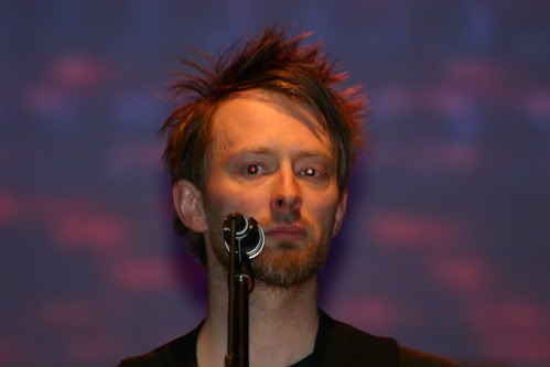
For this very special edition of Take Cover, we spoke with Stanley Donwood, the man responsible for all of Radiohead's album covers from The Bends on, along with most of the band's artwork. From the bare, bleak OK Computer cover to the vibrant shots of color that spray over In Rainbows, Donwood has helped to capture all the alienation and intensity of one of the most celebrated bands of all time. Plus: Without him, there would be no Radiohead Bear.
Donwood is currently displaying his first U.S. gallery show at San Francisco's FIFTY24SFthrough October 27. The show is called Over Normal and features some of the same bright, oil-based colors and billboard-advertisement concepts behind his subversive Hail to the Thiefsleeve. It finds Donwood turning words commonly found in spam e-mails and repurposing them as mutated and modern pieces of consumer art. Over Normal also features a vocoder-assisted, spam-based audio element called the Overnormalizer, created with John Matthias.
Click on to see some pieces from the show and read our interview with Donwood about his work with Radiohead and how his art has evolved over the years:

Hail to the Thief cover; "Forgot Was Sorry" from Over Normal gallery show
Pitchfork: Why did you revisit some of the themes and colors you used on Hail to the Thiefin Over Normal?
Stanley Donwood: The colors just look great because they're taken from signs of desire to be noticed at high speed. They are very pleasing colors-- but the frantic-ness and intensity of them is slightly disturbing as well.
Advertising is designed to be seductive and attractive and, in a lot of ways, it's very beautiful. But there's something unsettling about being continually sold something. I liked taking the elements of roadside advertising out of context because it removes the imperative and just goes to the essence of it-- the pure heart of advertising.
Pitchfork: I remember first seeing the Hail to the Thief artwork and thinking it felt ominous.
SD: That word occurred to me this morning when I watched the sea fog of San Francisco descend from the sky, obscuring the city minute by minute. It was very beautiful but also ominous, like a shroud, and I really love it when you get that strange combination of feelings that play against each other.
It's also ominous because all these colors that I've used are derived from the petrol-chemical industry. They're only possible because of the fractioning of hydrocarbons. That's how they get the pigments. None of it is natural. It essentially comes from black sludge. We've created this incredibly vibrant society, but we're going to have to deal with the consequences sooner or later

Pitchfork: Looking through your Radiohead covers over the years-- comparing the pale OK Computer with the vibrant In Rainbows-- it seems like you may have become more comfortable accentuating the more beautiful aspects of technology and alienation.
SD: Or I've become more jaded and weary. We were doing that OK Computer stuff back in 1996 and I was in my mid-20s and much more distressed by everything and maybe more hopeful that something could be done about it. Now it's just more hopeless, so I'm trying to be slightly happier with myself. No one really wants to be miserable all the time.
Growing up and living in England, I'm surrounded by grey skies and sarcasm, so when I came to America, my first impressions were bright, hopeful, cheerful. In America, the colors sing, they don't just glower at you. The West Coast especially is fantastic. It seems like you can do whatever you want here, which is not the case where we come from.
Pitchfork: So is that British mindset behind the gloomier palette of something like OK Computer?
SD: Well, I remember we were trying to make something the color of bleached bone. We had a rule that if we made a mistake we had to scribble over it-- we couldn't do the Apple-Z thing; we couldn't undo. It was done on an early Apple Mac. But I got very fed up with using just computers, because you're so restricted; you got a little mouse, a little light pen that you move about and you click and click and click. I wanted to use other things. I used paint a lot. For In Rainbows, I used hypodermic needles, syringes, ink, and molten wax. Especially after Kid Aand Amnesiac, which were very dour and gloomy, I wanted some brightness.
Pitchfork: Do you do work with a computer now?
SD: Yeah, but I enjoy making prints and things that are manual better. Computers don't seem real to me because there's a sheet of glass between you and whatever is happening. You never really get to touch anything that you're doing unless you print it out. I don't really enjoy making artwork on a computer because it doesn't seem like I've done anything.

"Desire Enlargement" from Over Normal gallery show
Pitchfork: It's funny, you're subverting advertising with Over Normal, but obviously a lot of your logos for Radiohead are really iconic and work well as ads.
SD: I grew up in the 80s and that was the first time advertising was considered seriously as anything resembling an art form. I was very influenced by that, but at the same time really resenting it and really hating commercialization.
Pitchfork: When you see something you've done on a t-shirt or a poster now are you still conflicted about it?
SD: Yeah, a bit. I come from a generation in England that considered making money or trying to promote yourself to be morally suspect. I love going somewhere like Japan where you can't understand a word of the advertising-- you just see it for its aesthetic beauty, without feeling that you're being sold something.
Pitchfork: Would you ever consider doing an actual ad for a company?
SD: It depends who they were or what it was. I wouldn't be crazy about it unless I had to pay a huge tax bill or one of my kids broke their leg or something.
Pitchfork: Have you been approached?
SD: Not really, no. I don't think they can find me. And I wouldn't go out looking for it.
Over Normal trailer:
Posted by Ryan Dombal on September 15, 2010 at 8 a.m.
No comments:
Post a Comment